This week’s Design File is all about colour (see Pantone). As those who heard my essay on colour for By Design a few years back will know, I have a kind of love-hate relationship with colour. This is perhaps odd considering I worked for many years for one of Britain’s most colourful fabric companies, Designers Guild (and odder still that I was the interior designer there for several years).
I love colour when it’s used in a beautiful way (think of India) but wearing colour scares me at times. I struggle to understand why certain tones just don’t suit. Maybe I’m colour blind? Thank God for dark blue.
But it’s not colour that is bothering me so much at the moment. My issue is texture. I’m considering adding another floor to my little house, which already has a painted texture that might at a pinch be called Tyrolean. Sloppy render could be another term.
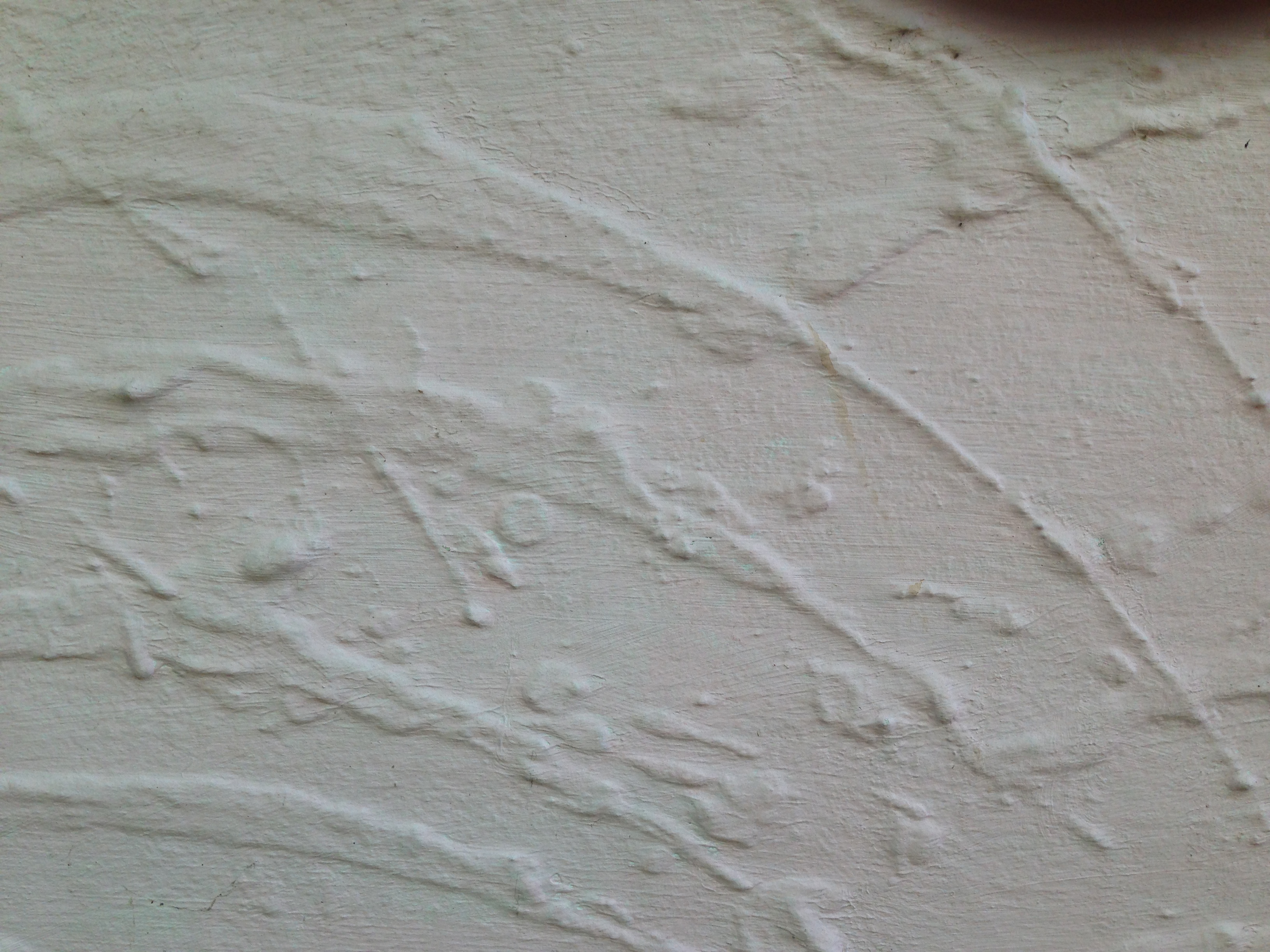
Tyrolean or just messy?
While I rather like it in its 1950s way, I don’t particularly want to continue this theme to another floor. The basic options are render, wood or metal and I suppose I could throw stone and brick into that mix. And so I’ve been prowling around the neighbourhood looking at other people’s renovations, feeling none the wiser but getting odd looks as I peer up to the bedroom floors.
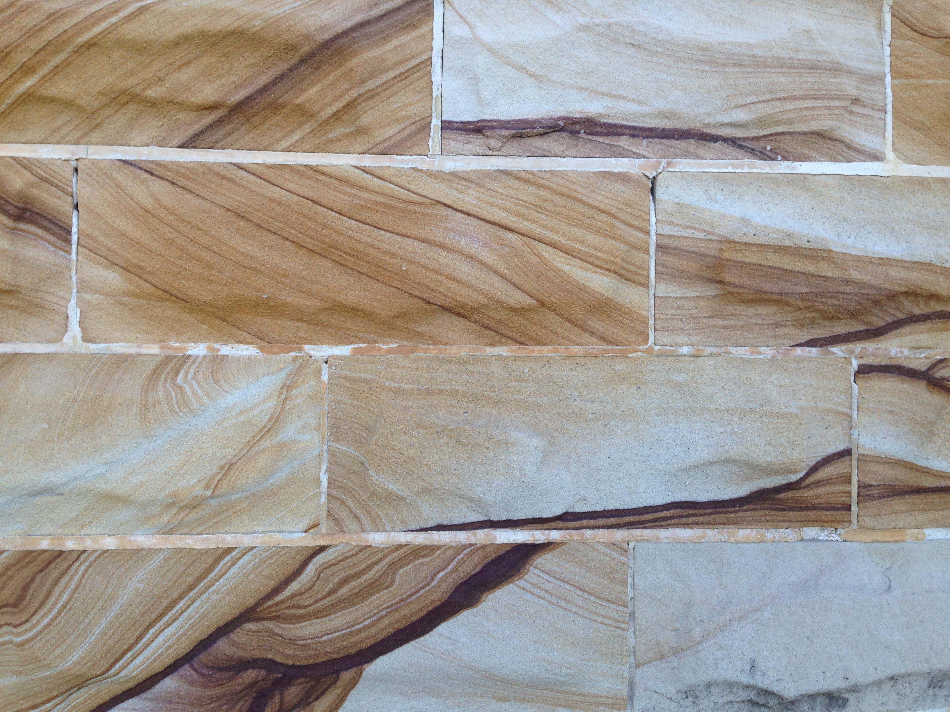
Sydney sandstone
I can’t stop looking at textures, and whatever I end up doing with the renovation, my eyes have been opened to the variations all about us.
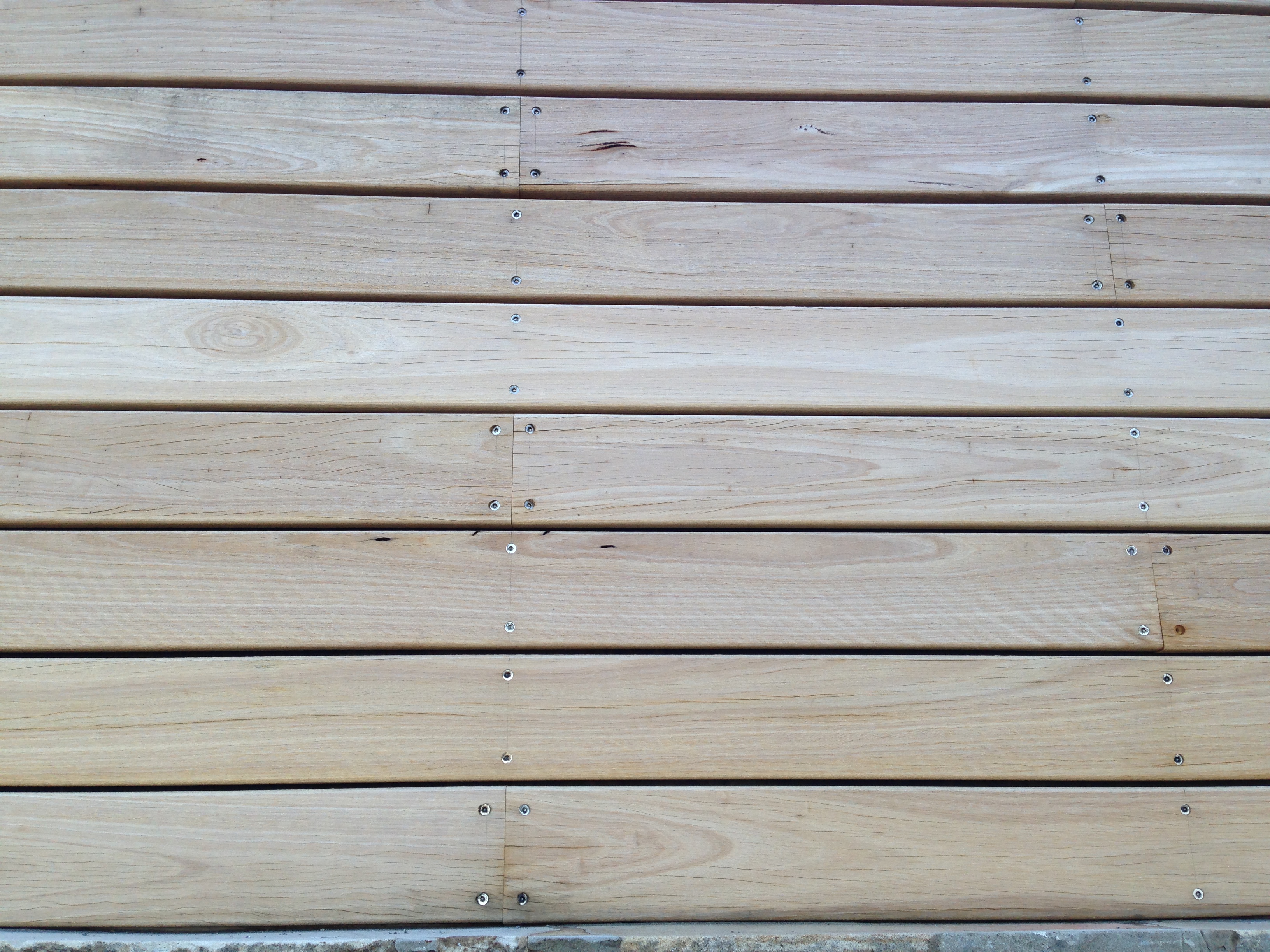
cedar
I was born into a house that had a harled exterior – the word ‘harl’ is used in Scotland to describe a sort of pebble-dash render that is then painted, although it is often left grey and rather dismal. The French use the word crépi for something similar and throughout France there’s been a trend to remove it and expose the stonework behind, which is literally changing the face of the country.
After the harled house we moved to a brick house which I couldn’t warm to although I like Dutch brickwork, which is when the bricks are very slim and give a streamlined effect. One set of grandparents lived in a house constructed of cedar, which was popular on the west coast of Scotland and gave the house a warm, friendly atmosphere and a muffled accoustic, while the other set lived in a very dour stone house, which was the norm on the east coast, that was always cold and echoey, fitting for the harr that rolled in off the sea.

UEA’s concrete ziggurats
(photo courtesy John Innes Institute)
At university in Norwich, the main campus was built from concrete (by Denys Lasdun), much of it shuttered (poured within planked moulds) which leaves the impression of the wood on the concrete. My faculty, however, was in the Sainsbury Centre which was all shiny aluminium and glass. Both looked brilliant contrasted with the texture of the grass that swept all around them. I think this contrast is important. Too much of one thing is over-powering, like a street that has no trees.
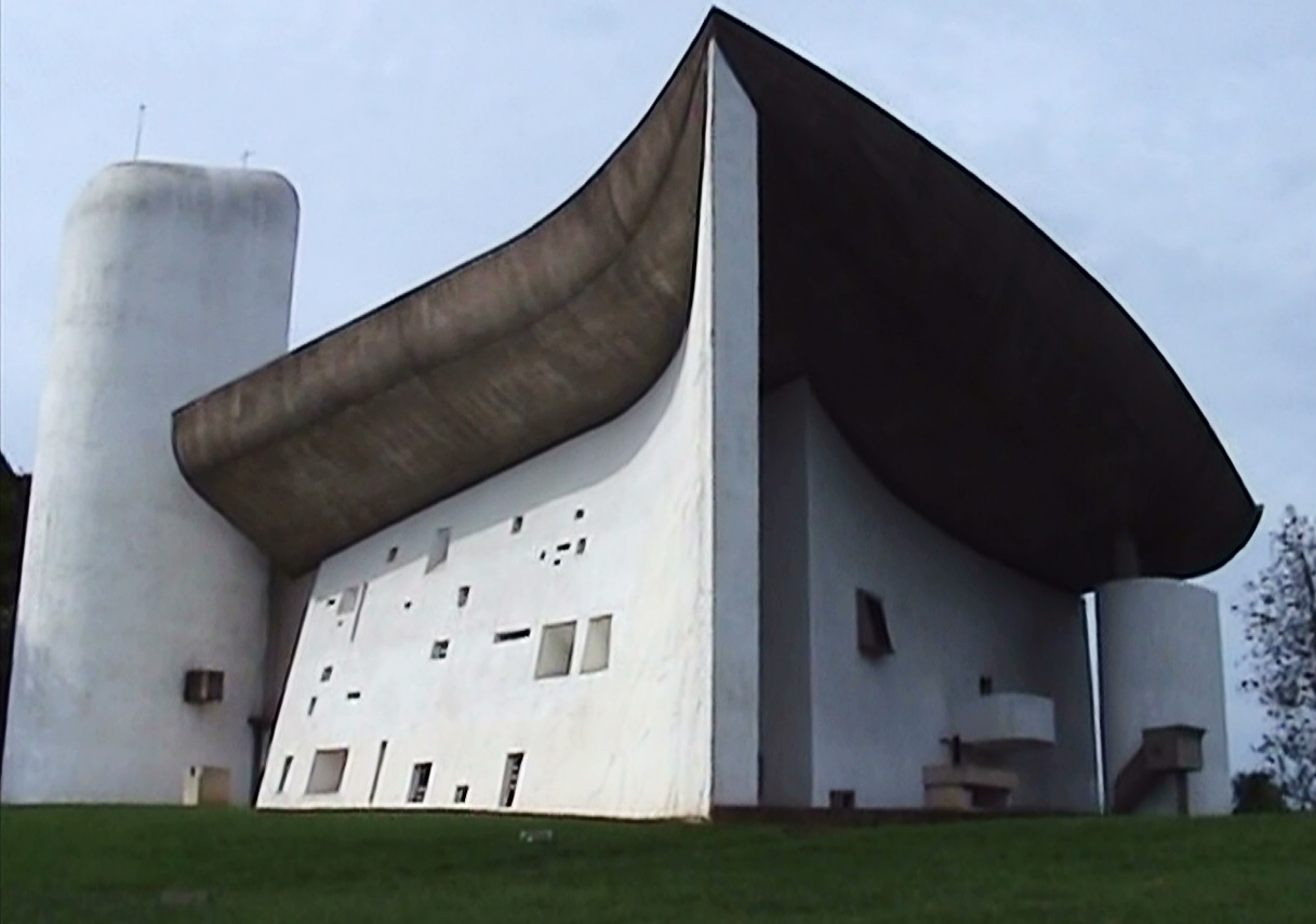
Le Corbusier’s glorious chapel at Ronchamp
Le Corbusier was pretty good at textures, as a trip to his chapel at Ronchamp will demonstrate. The rendered walls, deep window recesses, shuttered concrete roof and enameled entrance door are done with such a flourish, creating shadows that further embellish this extraordinary structure.

Ronchamp’s interior
The colourful enamelled door at Ronchamp
It creates an intensely moving building that is rightly hailed as one of the most important of the twentieth century. (And down the road in Audincourt’s simple church, you can see the gorgeously coloured stained glass windows of Le Corbusier’s great friend Fernand Leger.)

A Leger window at Audincourt
I’m still looking around me. What texture I end up with is still a mystery to me but I’m loving looking.

Aussie icon: corrugated iron.


I suppose what you have to ask yourself is, ‘What feeling do I want to create with this texture? Do I want to be calmed, to be energised, to be inspired’. Personally, I think the Sydney Sandstone would drive me visually nuts, and too much wood makes me feel like I’m in a 70’s sauna. Painted brick is always my fav. Though I quite like the look of the corrugated iron – it looks painterly.
So lovely to see those Lasdun ziggurats – memories, memories …
LikeLike
Thanks for the comments and yes, I think you’re right, it’s all about the feeling. So much of that comes from the contrast of different elements, like stone with glass or weatherboard with brick.
I’m guessing you’re not a chalet kind of person then, ha!
LikeLike
How dare you, Sir! No, too much wood. Painted brick, and when I say that I am, of course, visualising white painted brick (nothing original about me), makes me feel calm and also supported, if this is not too cheesy, by history, by the ages, by an ancient building form. I loved the light effects of the Ronchamp interior – just amazing.
LikeLike
Interesting point, that link to the past through simple materials. Like sitting on a Roman wall and thinking of the time the stone was first cut. Can concrete ever do this (apart from the concrete in the Pantheon dome, that is)? Yes, I commend everyone to visit the chapel at Ronchamp – truly a raised-hair-on-the-arm experience.
LikeLike
It is commonly believed that concrete was invented by the Romans (they used to build blocks of flats!) but actually it is an earlier invention. So, not to be dismissed too lightly – and the great think about concrete is its moulding properties. And of course you can paint it any colour you want …
LikeLike
You’re right – I shouldn’t be so glib about concrete. And it’s rather nice to think of Le Corbusier simply continuing a tradition from Ancient Egypt. And he was great at painting it, too – check out his unité d’habitations and their multi-coloured balconies.
LikeLike
WOW! Looks like a giant watercolour paintbox. I suppose you would have to be careful to choose the flat with the coloured balcony you could live with. And I imagine you weren’t allowed to change the colour. Did he only use specific colours?
https://www.google.co.uk/search?q=what+colours+in+Corbusier%27s+unite+d%27habitation&rlz=1C1ARAB_enGB452GB452&espv=210&es_sm=122&
LikeLike
I like the idea of choosing your home according to its colour! A Swiss company is now manufacturing his range of colours: http://www.lescouleurs.ch/en/le-corbusier/polychromie-le-corbusier/ . He was really into nature, which surprises many who think he was all white concrete. His development of workers’ houses outside Bordeaux in the mid-1920s was very colourful, breaking down the form, but they were famously overhauled by the occupants who blocked up the strip windows, added pergolas and made them look as ‘normal’ as possible.
LikeLike