What do you think of the word iconic? Rather like the word luxury, it’s thrown around with abandon: I can drink an iconic coffee at an iconic café on iconic Bondi Beach in the iconic sunshine of Australia, which is an icon of adventure and laid-back living.
What does any of that mean? A current example in Sydney is a building that is actually called Iconic and advertises itself as Sydney’s latest icon. It also says it was designed for living, which is good to know, given that it’s a block of apartments. But what’s it an icon of? Mortgage debt, poor sound proofing, generic design? I’m only guessing, but you can find that sort of icon ad-speak everywhere.

Blogger on the trail of icons
And yet there I am, writing a regular series on ABC radio about icons of design, including iconic buildings (although not Sydney’s latest addition, perhaps). I’m as guilty as anyone of using the i-word. But sometimes the word iconic or icon is apt. In my mind, something which is iconic encapsulates the essence of something bigger, standing for something new that ushered in change. Icons can only be appreciated in hindsight (unless you’re a Sydney real estate agent). It can be anything from a chair design, like Saarinsen’s Tulip chair that showed that legs could be replaced with a single pedestal, to the Moka stovetop coffee maker which made espresso coffee achievable without a machine. A building can represent a design movement – like the Hi-Tech Modernist Pompidou Centre or the Art Deco Chrysler Building – or stand for an entire city or country, like the Taj Mahal or Sydney Opera House. Icons of style, of culture, of identity.
I think you can tell when something is iconic. The easiest way is by its success – like the Biro ballpoint pen or the Peugeot pepper mill – and the fact that the initial design has barely needed to change over the following decades. Icons tend to be the things that have been endlessly copied – from Mies van der Rohe’s Barcelona Chair to Poul Henningsen’s artichoke lamp, often becoming icons of laziness (modern chair = classic design, therefore good taste).


I remember when I equipped my new office at Designers Guild in the mid-1980s the one thing I really, really wanted for my desk was a Braun calculator, the black one with coloured buttons designed by Dieter Rams, and which was the inspiration for the Apple iphone. It looked so great on my desk and even better, it worked beautifully. It is, perhaps, the iconic calculator, even though it wasn’t the first one (Sinclair did that).
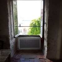
Of course architecture is my thing. Many times I’ve stood in front of a building and thought: wow. But that’s not enough. An icon is the essence of the change that made a difference, a sign of originality, and the embodiment of a breath of fresh air. Hence, Le Corbusier’s utterly wonderful Unité d’habitation in Marseille is breathtaking because it set into motion a whole series of copycat designs, even if few of them actually accomplished the goal of housing a community as successfully as this building did.

Unite d’habitation rooftop
Walking among the many Frank Lloyd Wright houses in Chicago’s Oak Park, I felt the presence of a creative energy that changed the way Americans would view their own homes. I felt it also when I saw Chicago’s early skyscrapers, including the rather lumpen Monadnock building whose load-bearing brick walls flare out at the bottom to accommodate the huge downward thrust of the many floors above. That’s the exception that proves the rule – an icon of the final flourish of convention before steel frames became the norm.


Life would certainly be different without various everyday inventions like microwaves and washing machines but there is often no single object that sums them up. Except perhaps the first bagless vacuum cleaner by Dyson which made us all go ‘wow’ at its colourful appearance before wowing us further when it actually lived up to its promise. Now that’s an icon of creativity, invention, design and modern living, and probably a few more things like colour or plastic construction.
I admit I love an icon, and the more I write about them, the more I realise the word is right. The key is to know what an object, a building or a car is an icon of, or else the word is completely redundant.
What do you think of the words icon and iconic? And what are your favourite icons?


The overuse of such jargon irritates me no end. When I worked in real estate marketing back in the early 90s, the account execs urged us to create a mystique around every big project they pitched for. Few homes were ever worth the use of adjectives like ‘iconic’ and I fought this kind of BS to the death (at least of the agency). It’s the difference between ‘homage’ and simply copying a winning idea.
LikeLike
I fear real estate agents can be the worst offenders, Mel. Iconic pops up regularly for no reason, and I’m always mystified by the regular description of terraces being ‘al fresco’ – um, yeah, they’re outside. But I snigger madly when I see some Godawful bungalow being described as ‘English manor-style’ because it might have totally inappropriate leadlight windows (in the aluminium frames, natch). Oh dear, you’ve got me ranting! I hope things are less cliched in French…
LikeLiked by 1 person
I suspect estate agents are amateurs when it comes to puffery. Have you read an architect’s or consultant spruiking some forthcoming attempt to shoe horn a monstrous block of apartments on a reluctant well-established community. “iconic sculptural form”, “landmark” “create a presence”. I could go on. “Gateway” is the word of the decade.
LikeLike
I think you may be right, Richard, and there are certainly so many gateways to…well. so much (and so little) these days. But I confess that I’m more partial to that heroic, overblown language than the totally absurdity of real-estate-speak with its stunted vocabulary. I’d love to see a totally honest use of language but I suspect they might sell fewer homes, and architects might win fewer commissions!
LikeLike
Sorry to be so late to this. I was walking past St Paul’s the other night and looked up at that dome. And I would definitely attach iconic to St Paul’s and also Big Ben and the Houses of Parliament. I think I’m close enough to the war generation to have in my mind those photos when the buildings all around St Paul’s were bombed but St Paul’s survived. It became a symbol of London’s survival. But equally I’d attach iconic to the brutalism (probably the wrong word) of the National Theatre on the south bank. I love to stop on Hungerford Bridge at night and look across at St Paul’s and also look at The National usually lit up with the sort of lurid colours I love. Two lovely icons from different eras in one go!
LikeLike
Absolutely agree with you – doesn’t St Paul’s make you slightly swell with pride? And the lovely Brutalist National Theatre is such an icon for our generation, too, I think, and the Brave New World we entered.I think the view from Hungerford Bridge is one of my favourites.
LikeLiked by 1 person
My love of these buildings is tied up with my love for Maureen – she’s a Londoner born and bred. In fact she was born in the blitz, into a family who did not think it a good idea to go down into the bomb shelters. It’s amazing she survived but I’m very glad she did!
LikeLike
The history of buildings intertwined with the history of people – perfect. And how wonderful (and rather moving) for Maureen to be represented by those particular buildings.
LikeLiked by 1 person
An apartment block ‘designed for living’ – priceless!
LikeLike
Icons immediately bring to mind the exquisite devotional pieces of the Orthodox church, painted on wood and gesso using egg tempera and gold leaf and created by monks in an atmosphere of silent spirituality. I also recently taught a lesson on ‘The Black Square’ by Malevich (a painting designed to create fury in those who dislike abstract art!) but was an amazingly brave work for 1915. When first exhibited, Malevich hung his Black Square across the corner of the room, as an icon is hung in Russian Orthodox homes. And the Black Square became iconic in itself, appearing at his funeral, on his coffin and on his memorial and as an absent artwork in Stalin’s Russia.
In terms of buildings, I think I would go for the Pompidou Centre. Apart from anything, I love its sense of fun.
LikeLike
And isn’t it interesting how challenging people still find Malevich’s work. I love the gleaming Russian icons, some so haunting, but I didn’t know they were hung across the corner in the home. I wonder why (although that’s very good feng shui, ha)? Yes, the Pompidou still has the power to elicit a little gasp whenever I see it – lovely that a building devoted to the arts should be so playful itself.
LikeLike
I know – I love it!
Icons are amazing. A unique and powerful artform. In answer to your wonderings – the icon corner is oriented to face east and across a corner to eliminate worldly distractions and allow prayer to be more concentrated. Ideally, the icon corner is located so that it is visible when one first enters the house from the main entrance and traditionally, when first entering the house, an Orthodox Christian would venerate the icons before greeting
the members of the house.
Aaah, to be in Paris again …
LikeLike
Thanks for the icons corner info. It’s not the first time I’ve come across the idea of something important facing whoever comes through the door. I think it’s so important to ‘set the tone’ like that, not necessarily for a religious message but simply as a kind of welcome.
LikeLiked by 1 person