I’ve just finished re-reading a magnificent book that was written by architect Robin Boyd and first published in 1960. I think it should be mandatory reading for anyone interested in Australia because it is not only savage and hilarious but spot-on. It has a big main theme: the Australian love for what he called Featurism, and why. Much of what drives Australian taste, he posits, was the fear of the natural world.

‘The greater and fiercer the natural background, the prettier and pettier the artificial foreground,’ he wrote. The result was a mishmash of styles, nothing really meaning anything. He describes Melbourne as ‘a dressmaker’s floor strewn with snippings of style.’
I have a rollercoaster relationship with my adopted country. I marvel at the beauty of its natural environment, and the sometimes old-fashioned ease of the place where businesses don’t see the need to take deposits before they start your order, and where I can often see my doctor or dentist on the same day that I ring for an appointment. But I have always been dismayed by its buildings. Of course there’s some good stuff but most of the built environment is pretty bland, if not downright ugly. Which is why Boyd’s book still rings out loud and clear.
And so I thought I’d take you on a little walk, one that I do most days, to show you why.
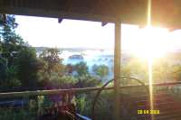
As I walk down to the beach, I pass this:

Where on earth?
It’s the backyard of a house which the occupants obviously wish was in some Mediterranean village. That entire wall, complete with flowering shrub and leaning bicycles, is essentially a vast photograph acting as a fence. Do those roofs beyond add to the vibe? You’re right, they don’t.
Next, as I walk on a lovely pathway beside the sea, often watching dolphins frolicking in the surf, I pass this house.

pick’n’mix
It used to be a very ordinary place given Federation touches – a wooden veranda, wobbly barge-boards and finials on each gable, the pretend multi-paned windows. But recently it’s been given a Featurist make-over. Classical-looking stone facings were added to the window surrounds and at the corners. And then the veranda was extended and steps added, all covered with travertine tiles that relate to nothing else (no lip, even, on the steps to match the traditional style). A deck was placed in the garden, using composite decking that will never rot, and then a large planter was built, which was faced in a rough stone quite different from either the fake-stone cornerstones or the travertine tiles. To cap it off, the lawn was removed and replaced with synthetic grass to provide a uniformly green sward that will defy the strongest weed.
This then is Featurism writ large. It is a little bit of this, a little bit of that. As Boyd says, “Featurism works on the principle that one cannot have too many good things, even conflicting things, provided the eyes are kept entertained.”
Perhaps surprisingly, this is not a matter of snobbism or what constitutes good taste. Boyd speaks about the success of buildings that have a strong central motivating idea. This design integrity means that each part of a building relates to the other. It is why the Sydney Opera House works and why Palladian villas work and why Le Corbusier’s Unite d’habitation works, and why this building at the end of my walk works.


This house is called Apollo Gate and was designed by architect Reuben Lane in 1969. It wouldn’t look out of place on the Cote d’Azur. It doesn’t matter if it appeals to you or not. The point is that the whole building has been designed as a whole, in this case a home built around a space large enough to hold chamber concerts. It has the integrity of a central idea. There are no quirky gables or sudden changes of materials or extra windows in a completely different style. Its huge presence offers welcome respite from its Featurist neighbours with their fussy bits’n’pieces.
This morning, as if I need to torture myself any more, I drove around a new housing development on the edge of my suburb. It’s tucked beside the remaining sand dunes of a long and beautiful beach, although the site itself was sand-mined and consequently the houses all sit in a kind of hollow, without views.
")


They’re all different and yet all the same – an assortment of materials with stone or slate glued on to walls that have no real use except to break up the façade. Slanting roofs lead you to believe there are clerestory windows letting in light to darker parts of the buildings but no, they’re there to add a jaunty angle. This sort of development is found everywhere across Australia, from Darwin to Perth to Adelaide, regardless of regional climate differences. Gardens are small but usually filled with further features with nothing allowed to proclaim itself as a simple wall, and no space for proper trees. Walking around I began to feel breathless, smothered by the awfulness of it all. It has, as Boyd would say, a frank and proud artificiality.
What’s the answer? Boyd advocates real architecture, and education of both architects and the general population. But in a country where you still see houses named ‘This’ll Do’ I think there is still a long, long way to go. The last paragraph of The Australian Ugliness sums it up beautifully:
‘The Australian ugliness begins with fear of reality, denial of the need for the everyday environment to reflect the heart of the human problem, satisfaction with veneer and cosmetic effects. It ends in betrayal of the element of love and a chill near the root of national self-respect.’
So what’s the ugliest building you know?


The ugliest? Hmmmm, I’m not sure… I’ve seen a few… but I felt I had to say there are lamb chops and sausages missing from that ‘lawn’.
LikeLike
Haha! I’m sure you can get fake ones, like dishes displayed outside a Japanese restaurant. Heaven!
LikeLike
That’s easy (I know you’re going to blow a foofoo valve but here it is anyway), Horizon (and anything else designed by that awful Siedler man except for rose seidler house). GO on. I know you’re going top be unimpressed but I absolutely loathe Siedler. and WTF is Blues Point Tower all about? The man should be sued!
LikeLike
Well now I’ve adjusted my foofoo valve, I do understand although I don’t agree. I’ve never felt Seidler is top tier and Blues Point Tower is not, frankly, doing a great job of selling him. BUT I think his work has integrity and thought. And God knows we need more of that.
LikeLike
I’m may be in a minority but while it may have been innovative when built, Rose Seidler house does not impress me. His own house is another story and deserving of the accolades it has been given.
LikeLike
It’s that dilemma when something groundbreaking leaves you feeling a bit blah. I agree that it’s certainly not in the same class as the Farnsworth House or earlier houses from Le Corbusier but it’s still an important house for Australia.
LikeLike
I love “Apollo Gate’, it is sleek and undistracted. I could live there!
It’s very hard to single out one, but there is a spectacularly ugly building in my UK neighbourhood, which has been hilariously over-extended and the owners have now added skinny columns to this cheap and poorly made site. It’s on a main road where we get stuck in traffic each day and it’s hard not to laugh and point. One of the perpetually ugly things in older houses is the replacement of leaded and stained glass with UPVC versions of the same, and the false barred UPVC windows we see everywhere. If you’re going to have UPVC – please use plain glass instead!
LikeLike
I love ‘hilariously over-extended.’It’s so often the case that people add more believing it will be better but for many of us, less really is more. But they might just adore their home in which case, why not? But I suspect in most cases it’s all done with a level of uncertainty. Thankfully Australia has never adopted the uPVC window!
LikeLike
Would UPVC cope with the more robust sunshine? Especially for guttering.
LikeLike
Well, one of the ugliest buildings I know is just down the road, so I best not identify it……It’s owners have lavished a fortune on this vile edifice
LikeLike
I remember working with someone who told me that she would be really stylish if she had lots of money. Same goes for buildings, I think.
LikeLiked by 1 person
You can’t buy style. Which is a good thing as we haven’t any money left……
LikeLike
Chic at any price…
LikeLike
Great article. I read this book recently too and was amazed at how much it resonated. I am a British architect and we attempted to emigrate to Australia back in 2013. Indeed, we are currently considering trying again as we did love the Country on balance – however – I do have an on-going problem with the incessant featurism and inappropriate scale so rife in much of the built environment. It was to such an extent that during my time in Perth there were certain areas which caused genuine nausea which amazed me even if to confirm the responsibility my profession has and the powerful effects of bad design. Context is everything to architecture, it sets the stage and must be respected over and above anything else. I was therefore amazed at how crass and obscene many or indeed most of the frontages were lining the beautiful beaches / Indian Ocean in Perth – it felt tragic in its brutal indifference and imposition in an otherwise pristine and incredibly sensitive natural environment. I do however equally feel that Australia is ‘onto’ this and there is a significant shift in quality in more recent times. Many of the masterplanned communities we visited in outer Perth for example were superb and indeed even pioneering in a global sense. It will always be a difficult balance to strike for Australia.
LikeLike
Thanks for your wonderful feedback.You nailed it with ‘brutal indifference.’ I like your optimism and it’s true that there are some (but not many) housing schemes of different types which have been sensitively designed. I’ve never been to Perth but I always remember hearing Robert Hughes describing the grand houses on the Swan River as being like ordinary little houses that had been inflated with a bicycle pump. Given that so many Australians knock-down-and-rebuild I just wish there were more companies who valued design and showed that it could be done, instead of all the fancy tricks the provide…Do come back, we need you here!
LikeLike
The Florey Building by James Sterling in Oxford is fairly foul. It’s the red brick and then all that glass. I’ve always hated it. It’s part of Queen’s College where I grew up and it’s so different to the main Queen’s buildings. I was there when it was opened by the Queen Mother and had to present her with flowers aged seven. I didn’t like the experience much which may be why I don’t like the building!
LikeLike
Love the Royal touch – I’m sure any seven year old would have been scared simply by her feathery hats! Not sure about the building either – it always reminded me of some kind of fruit that’s been sliced open. A bit like the British Library. I suspect brick is always difficult in a city of stone like Oxford (barring the Victorian brick of North Oxford).
LikeLike
It’s not exactly a building but Sydney’s Railway Square gets my vote. Nothing works in the entire bus interchange area, including the slanted glass roof that doesn’t protect commuters from the belting rain; the ugly metal sculptures; the nasty cafe on the southern end, plopped onto the plaza like a carbuncle. What a wasted opportunity to do something really nice. And it’s always grubby.
LikeLike
Oh yes, it’s a lovely piece of Featurism. The first time I saw it I thought: oh, that’s kind of interesting, which is the classic thing that happens until you look more closely. And yes, the struggle to find shelter from the rain while waiting fora bus just cements its complete lack of grace. A beautiful Moreton Bay fig would have done the job much more elegantly and successfully…
LikeLike
What a great post!
Would it be fair to say that a lot of the older featurist elements are harking back to European elements? Perhaps a wishlist …
One new building I find ugly, is the new library in Birmingham. Inside it is great – a real temple to knowledge. But the exterior is so fussy – it looks like a cross between 1960s wallpaper and macrame. Don’t understand it at all. Birmingham is such a mixture of architectural styles; to my mind the new building needed to provide some visual calm.
LikeLike
I am in two minds about the new library in Birmingham. At night and lit up it has more presence
LikeLike
I think there’s often a strong reliance on the dazzle of lights in some buildings. Over here the real estate agents do ‘dusk shots’ of houses for sale, glowing with light against sunsets, which makes even the most banal place look almost glamorous.
LikeLike
Gosh yes, it’s very tinselly. I feel a bit assaulted just looking at photos of it. But I’m glad to hear it works inside, which is what matters more, I suppose. Re Australian Featurism, it actually leans more towards American taste as it tried to jettison references to ‘the old country’ as a way of showing itself to be an independent country, although there’s a strong element of casting around for anything ‘interesting.’ The great period of Featurism is the 1950s when the country’s population increased massively, not only with immigrants from the UK but from Italy and Greece (and elsewhere). As Boyd pointed out, though, the new immigrants tried to assimilate and rather than getting a lovely influx of Mediterranean-influenced buildings they just kept on with what was already here. Such a shame. But we did get great coffee bars…
LikeLike
I recently cycled along Botany Bay in Kyeemagh and gasped at some of the houses there. They might have been ambitious projects and have a ‘Grand Parade’ postal address but certainly would not feature on ‘Grand Designs’… Not only do most of the individual dwellings feature odd mixtures of various styles but the entire street itself is a mess with every house jarring with its neighbours.
LikeLike
It’s always a shock going to areas you haven’t been to for a while and seeing these new projects everywhere. Grand Parade is certainly a peon to Featurism. And the jumble of styles isn’t helped when there’s no breathing space between each place…Too depressing yet seen as smart and even chic by some.
LikeLike